
Logo trends to avoid in 2020
- Alli Beck

- Sep 2, 2020
- 5 min read

Do you all remember snap bracelets? How about wearing two layers of socks that you bunched down around your ankles? My favorite was the bird bangs that we teased into sculptures with Aquanet. (Yeah, I'm aging myself here.)
If you didn't grow up in the 80s, you may have no idea what I'm talking about. You don't see any of those things now.
That's because they were trends. Trends come and go.
That's why its important to avoid trends when it comes to your logo. A logo is something that needs to stand the test of time. There are some things out there that seem attractive now, but in two years will look like the relics of the 80s listed above.
Here are some logo trends to avoid so you can establish a signature mark to represent your brand that is classic and timeless:

1. Standard or cliche fonts
This is a big logo faux pas that spans the arch of time. Ever since computers came with fonts, they have started popping up in business’s logos. Why? Well, they are accessible and easy to plop into a name. The problem is, everyone knows what Helvetica looks like. And it looks … sooo tired.
Remember when the movie Avatar came out? A million designers across the globe cringed when someone made the decision to use Papyrus as the font for the movie’s title. (Papyrus is pictured above). It’s a played out font that is instantly recognizable and therefore cliche as they come.
Same with comic sans, Times New Roman, and the lesser-known but still overused font, Scriptina.
When selecting a font for your logo, do a little digging to find something unique to your brand.
I’m not suggesting to find something too wacky. Simple and classy are still good qualities to seek in a font. But stay away from the fonts that come with your Mac or PC, or ones you see everywhere. It may mean you need to spend a little money on it. That’s ok. The one-time cost will be worth not seeing your font everywhere.
When it comes to a logo, you don’t want generic.
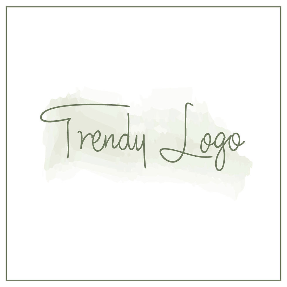
2. Watercolor backgrounds
This was a big trend last year, and it has slowed a bit. But I still am seeing it. Logos with watercolor backgrounds use a splash of color textured to look like watercolor behind a logo’s graphic.
It may present the soft, feminine feel you are looking for, but it is neither practical, nor will it last.
First, there is a bit of transparency that is built into water color textures. This is a challenge when you lay our logo over a photo with another color. It will take on a bit of that color instead of remaining true to your brand colors or make your logo appear washed out.
It also tends to give logos a shape that is harder to work with. Instead of a rectangle or square, it usually is a tilted oval and has jagged edges.
Watercolor use in logos smacks of trend all over it.
Feel free to use watercolor in other elements of your brand such as textures you use on your website or social media posts. Those you can ditch if the trend loses steam. But, please, don’t incorporate watercolor into your logo.

3. Multiple gradients
Multiple gradients are where one color fades in to a lighter color. This trend provides some of the practical challenges that watercolor textures do in a logo.
It is usually ok to use them in moderation, but having several gradients is not a good idea long term. For one, best practice is to limit your colors two two or three in a logo.
But you want your logo to stand out, not fade into the background in certain spots.

4. Overlapping letters
Some scripts have looping gs, ys or other letters that can look ok alone, but pair them together and it is just chaos. Overlapping letters make your logo appear off-balance and messy. You don't want a logo that looks like someone's sloppy handwriting. It makes it hard for the eye to know what to follow.
P.S. In my sample logo, I used the font Scriptina, so this is a double whammy of logo trends.

5. Thin lines
I have to confess, I struggled to put this one, because I like it. There are so many beautiful logos out there right now with these wispy lines that are delicate and subtle. They look nice. Sweet.
While they look great on a portfolio or Instagram post, they aren’t always practical in the real world.
Try to overlay that logo on a photo and it almost disappears. Try to put it on a sign, and no one can read it. Heck, try to put it on the header of your website. Still no one can see it.
A logo has to be more than pretty. It needs to be effective. You need it to work in a variety of applications - large and small. Be careful when you select your logo that you aren’t so enamored with its elegance that you forget you need people to see it.
To be frank, the best way to avoid logo trends is to hire a professional to design your logo. They are more likely to have their finger on the pulse of what is timeless versus something that is a logo fad. They will also do the hard pre-work to really determine your target market, the best brand identify to fit that demographic and design something that is unique to you. That said, even designers aren’t immune to trends, so it’s good to be aware of what they are and fight the urge to use them.
The best logos are simple, classic with a unique twist, and versatile. They need to look good when you blow them on a large sign or shrink them down to a tiny business card. Too often, business owners want to throw the kitchen sink at their logo, hoping it can capture all the elements of what they do in one single graphic. Or they want a copy of something they keep seeing on Pinterest.
Your logo is the center of your brand's identity. Make sure it is uniquely fitted to your target market and your business.
Ideally, you will design a logo once and may have subtle changes made to it in about seven years or so. You don't want to keep overhauling it. It is not good for your brand or your business's pocketbook.
Simplicity is powerful - and often has the best longevity. Skip the trends when it comes to something as important as your logo.
Curious if your logo is a little too trendy? Book a free consult and I will take a look at it for you.


Comments